A product redesign that enabled enterprise architects to focus on higher-value work, and gave ServiceNow an improved licensing model to grow revenue.
Role
Staff Product Designer
Duration
Q3 2023 to Q2 2024
Team (of 8)
2 PMs + 4 Engineers + 1 Researcher + Me
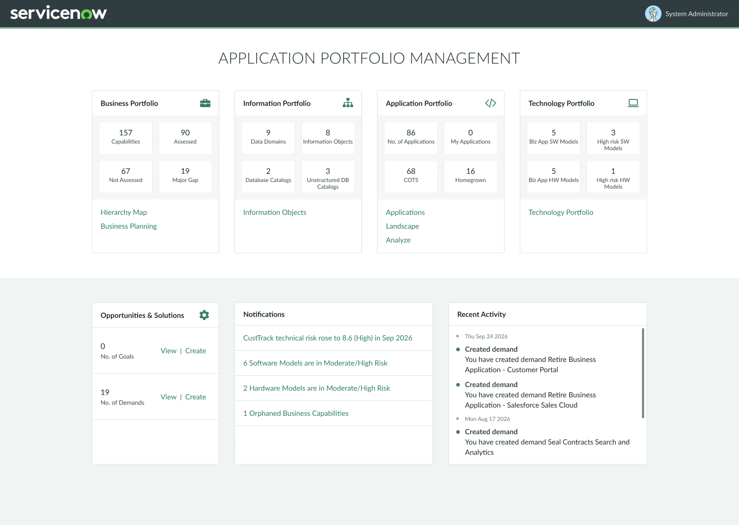
Old experience: Application Portfolio Management (APM)New experience: Enterprise Architecture Workspace (EAW)More than a refresh
APM was built without Design as a core partner. ServiceNow’s customer began to notice competitors, usability issues and product gaps. A messy navigation hid what the product already offered. The burden of manual work to product insights combined with an outdated product was eroding trust and excitement with customers.
The ask was to refresh an outdated product. I reframed it around navigation, and around how features could be sliced for licensing.
Key calls
APM had no navigation of its own. Users reached modules through the platform's single menu for every ServiceNow product, which meant users had to memorize module names, or through links on Home cards. The new information architecture puts the modules architects use every day into the workspace's own navigation and tucks the rarely used ones away. Widgets that were scattered across pages became a single Dashboard module.

-
New Home surfaces health widgets that show relationships or the lack of it between items. In APM, fetching that insight meant manually digging through scattered lists and tables. Product asked for everything on one page; I argued that quick answers and deep assessment are different jobs, justifying separate modules for Home and Dashboards.
User quote: "I love that everything is right here where I want it."
-
Widgets on Home and Dashboard are starting points, not just displays. Clicking a slice opens a list of exactly those items, and the widget's more menu lets users pick one or several slices to apply as a filter on the dashboard (right-clicking a slice does the same), so no one has to open the full data set and filter it again.
-
Diagramming meant leaving for a third-party tool with no access to ServiceNow data, so architects built every diagram by hand. In-tool diagramming, connected to the platform's data, now generates a diagram for any business application in one click, with each shape carrying its live scores and health flags.
User quote: "Generate diagram works like magic. It makes it so easy to see my application connections."
-
Overlapping bubbles hid data because users could only select the top one, and the chart shared a cramped page with filters and a list. Numbered clusters now open every application inside, the chart and the list each get their own view, and demands sit under their application.
Outcomes and ripple effects
Three out of nine tasks couldn't be done at all in the old experience. On the six that could, five got about two to five times faster and one stayed the same. Based on 20 usability sessions with 10 customers.
-
New product features gave the business something new to package. Diagramming opened the door to the Pro Plus plan, alongside other new offerings. This structured licensing model supported revenue growth.
-
Reached parity with competitors in diagramming, dashboard insight and total cost of ownership, closing the gap behind the lost customers. Three of the nine tasks we tested had no equivalent in APM.
-
Architects moved from collecting data to analyzig and acting on it.
User quote: “The new experience saves me so much time and manual work.” -
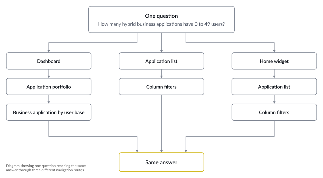
Not a design goal; it surfaced in usability testing. APM relied on memorized navigation. With the redesign, we saw user shift from the memorized approach to a more fluid multi-route navigation approach based on their workflow. This showed increased user confidence and their improved understanding of the space.
Ask me about
APM had no navigation of its own. Users reached modules through the platform's single menu for every ServiceNow product, which meant users had to memorize module names, or through links on Home cards. The new information architecture puts the modules architects use every day into the workspace's own navigation and tucks the rarely used ones away. Widgets that were scattered across pages became a single Dashboard module.